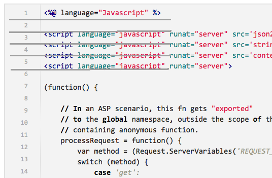
I use github gists, and sometimes I want to embed a gist into a blog post. Using the script block github provides gives me poor results. There are several problems:
- The main problem is the line numbers on the left-hand side don’t line up with the lines of source, on the right hand side. I’ve shown that in the image above with the grey lines I’ve drawn in after the fact. (No, the grey lines do not show up in the original.) My blog styling is interfering with the gist styling.
- There is no styling guide. I want the font to be smaller, and I want the width to be settable, and I want the div to scroll vertically, and it should be limited to a reasonable length. I will have to open up Firefox inspector to figure this out; it’d be nice if github provided some hints for me.
Good effort by github, but not usable for me out of the box. I resorted to using the github api directly, and embedding the retrieved content using jQuery. This is also not optimal because the styling and line numbering is missing. See my recent post on ASP Classic for a visual example. Also it takes longer for me to write the markup that does this.
With the help of this blog post, which I found from this stackoverflow question, I was able to style it properly without doing too much css archaeology. Reasonable result:
