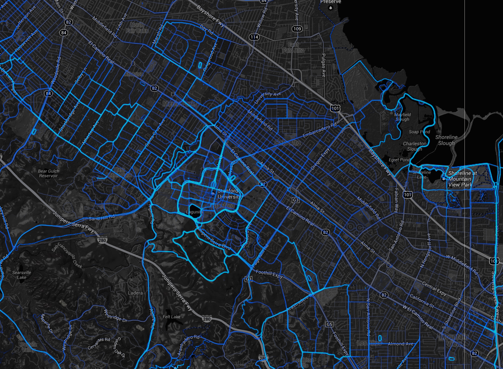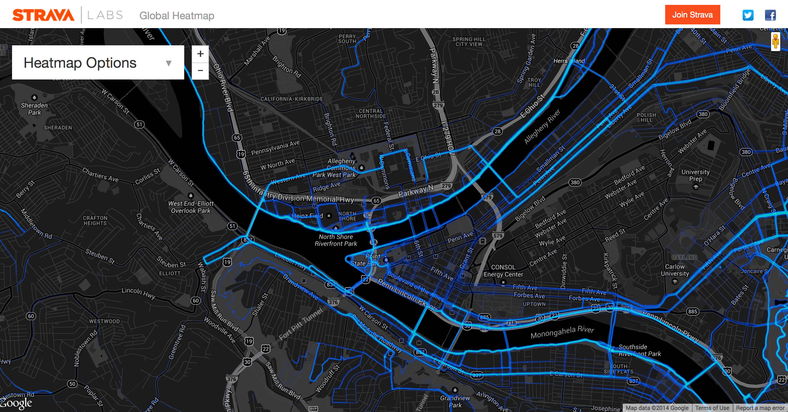
I’m currently digging the heatmap that Strava produces with running route data.
If you don’t know about strava.com, it works like this: get a GPS device, go for a run, upload your data to Strava, and they log it for you. You can then view interactive maps showing where you ran, and you can do analysis of your runs over time. With the growing popularity of fitness-oriented GPS-enabled devices from companies like Garmin and Timex, or even your iPhone, you can get really interesting data on your runs.
I love this stuff. I started using this kind of upload-share-and-analyze site a few years back, when I was regularly going out on long bike rides. Right now, I am doing more runs, but I haven’t been carrying my iphone because (a) it’s just too heavy; in the summer months I don’t want that thing strapped to my arm, and (b) the GPS kills the battery in the phone after only about an hour. But I really want to get a GPS-enabled heart-rate-monitor watch to make it all super easy and convenient, and get back to collecting my own fitness analytics.
Aside from my personal use of this technology, the presentation of the data is great! At a glance I can see the results of the data aggregation that Strava has prepared – I can see the most popular running routes in Pittsburgh, or any locale. The heatmap is just a visualization of all the routes that have been uploaded and shared on strava.com. Awesome!